unix-guy
Master of RTFM
Nice!It was discontinued because it doesn't work in Windows 11. We are rebuilding the plug-in now and adding all the new content. Should be available soon.
Nice!It was discontinued because it doesn't work in Windows 11. We are rebuilding the plug-in now and adding all the new content. Should be available soon.

Everyone knows virtual faders don’t sound as good as virtual pots.It’s really pedantic, but IMO the volume controls on the cab block should be faders and not pots.
And I like that they’re inversely linked, but I’d also love the ability to unlink.
Vertical faders very quickly distinguish what the control does visually without needing to look around or read. The plugin already uses faders for levels in places - IMO pots are fine on things like a drive pedal, gain control or master volume. When it’s purely clean volume affecting an output, a fader just does the job better.
Having the same style knob for so many features, regardless of what the control does (and its overall importance) is not optimal design. The pots aren’t really helping anything here.
I mentioned before about some channel EQ being really useful prior to summing. Something more akin to a channelstrip where there is polarity, filter, eq, pan and fader would be amazing.

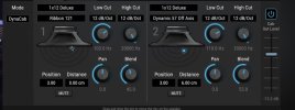
Just so I’m clear - what’s the benefit to the user to have the same knob style for pan, high cut, low cut and volume? Is there a benefit over having slightly different sizes/colours/positions for things that do vastly different things.Personally I like the current look of the amp block.

Just so I’m clear - what’s the benefit to the user to have the same knob style for pan, high cut, low cut and volume? Is there a benefit over having slightly different sizes/colours/positions for things that do vastly different things.
View attachment 166587
It’s functional and gets the job done, but IMO the filters could be smaller with a different knob style, Pan could have a different knob style or colour, blend could be faders along with the master fader on the right. A horizontal bar for panning would be pretty unambiguous without needing to read anything.
Giving them all the same level of visual importance doesn’t really add anything to the user experience. It just means you have to do more work looking for things and reading.
This just comes down to good or bad design. Bad design would cause issues, implementing it well makes things easier.I personally think if things get too colored or different it can create focus issues.
This is precisely the point - in good design, your eyes should be drawn to the most important controls with a hierarchy. Having them all of equal visual importance is what makes things slower and more cluttered to use. High cut and low cut should not have the same importance as volume. There isn't really any visual clues on what the most important controls are - the user has to do work to figure it out. Good design should minimise this.At least to me when looking at this cab screen everything feels natural and nothing jumps out that wants me to keep focus on it only and makes me forget about some other parameter etc. My eyes can wonder fine across the screen without feeling like I forgot something somewhere else or trying to remember a smaller or bigger aka different knob, or trying to remember a green or red or purple knob for a specific thing etc.
It must be, since we have not seen this on any other system. @samschachter and @Michael Pickens may be able to force this color here in case Windows is somehow trying to override it.this may be a local settings issue,
View attachment 166573
The controls are a "blend" between the 2 IRs. Unlinking would break the whole paradigm...And I like that they’re inversely linked, but I’d also love the ability to unlink.
I get it. And try to find more of a sound design nerd than me. My ever email of sonic substance to Cliff was about polarity!I mentioned before about some channel EQ being really useful prior to summing. Something more akin to a channelstrip where there is polarity, filter, eq, pan and fader would be amazing.
Correct. Based exactly on AM4, the ICONS blender is a response to, well, a lot of people complaining that individual "Cab Levels don't work".The controls are a "blend" between the 2 IRs. Unlinking would break the whole paradigm...
https://docs.google.com/spreadsheets/d/11-cuwoBO-5Ai3oFrtpC3ikNDEvRI4dEmMSGpO4N_ghI/edit?gid=0#gid=0Uniformity creates simplicity. Pan, High Cut, Low Cut, and Blend are controls of equal importance, so they share the same style. Related controls are grouped spatially. This consistency keeps people unperturbed and moving forward.what’s the benefit to the user to have the same knob style for pan, high cut, low cut and {blend}

Thanks dork! Nice tool.By the way... I made a dB <--> Blend converter for dorks like me. Duplicate it for use.
Code:https://docs.google.com/spreadsheets/d/11-cuwoBO-5Ai3oFrtpC3ikNDEvRI4dEmMSGpO4N_ghI/edit?gid=0#gid=0

Cheers @Admin M@ - I think this is probably specific to the DAW I'm using (Cubase 15). I tried in standalone mode and it's fine - white box. Have edited my post. I'll play some more later to see whether I can do something within the C15 config.It must be, since we have not seen this on any other system. @samschachter and @Michael Pickens may be able to force this color here in case Windows is somehow trying to override it.
I’m not sure I agree with any of this, but I respect your opinion. The examples of it being distracting are bad are because of bad design, not to do with colours or anything else.Uniformity creates simplicity. Pan, High Cut, Low Cut, and Blend are controls of equal importance, so they share the same style. Related controls are grouped spatially. This consistency keeps people unperturbed and moving forward.
The Cab basic screen is nowhere near busy enough to require extensive differentiation. Each side has fewer knobs than many analog pedals. The only intentionally distinct visual element here is the mic position dot, because it requires a fundamentally different interaction.
On the same principle which explains why a Bassman or a Diezel or a Mesa doesn't have Red, Blue, Yellow AND Green knobs, it would be disturbing for any control or group to so much as whisper, "Psst... Caveman... look at me!!!"
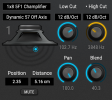
Also, color is deliberately reserved for MIDI control/modulation, so it carries meaning that can't be mis-used here. PS: as a matter of accessibility, we don't use color alone for UI differentiation; you'll also see a dot by the modified parameter name as shown below.
View attachment 166613
We're just going to have to agree to disagree. Anyway, feel free to send me a PM if you want to continue the chat.Blend/volume is the primary control out of these 4.
I think Rotary might be its own plugin, appropriately priced. The applicableness outside of ICONS is vast.Rotary
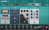
Pic for reference...I’m not saying this is an amazing example, but imagine if everything here used uniform controls:
https://www.uaudio.com/cdn/shop/files/paradise_guitar_studio_gallery_3.png?v=1768333990&width=1920


