Wish Differentiate Channels with colors

jordikt

Experienced
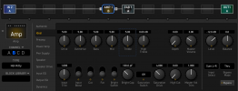
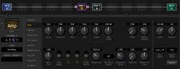
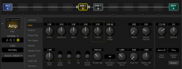
The wish is to keep the current orange color of Channel A, but differentiate channels B, C, and D with different ones.

It could be something like this:
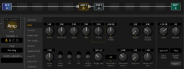
A.png


B.png


C.png


D.png


In AXE-Edit and FM3-Edit the color would be visible in the letter of the field CHANNEL, on the outline of the block, and in the square of the focused item.
In the unit, the different colors would be visible on the outline of the block.

Benefits

1- Avoid mistakes

A lot of times I find myself changing parameters in the wrong channel.
For example, I have the channel A of the amp configured perfectly in the scene 2.
I go to other block, to other scene, I do several things in the preset.
Then I go to scene 3 to configure the channel B of the amp for the scene 3.
I move parameters for five minutes, and then I realize that I was in channel A instead of channel B, and I have ruined the scene 2.
Different colors would avoid these kind of confusions.

2- A kind of memo notes
Several threads have asked for memo notes for channels. It seems difficult to implement due CPU and/or memory usage.
Different colors per channel can be used to remember the configuration of channels..
For example, an extreme delay in channel A (orange) and a soft delay in channel C (purple).
Or a clean amp in channel B (blue) and the amp configured for lead in channel D (yellow).
The tone of the colors I have used is not accurate. Colors should be so different to achieve the goal of avoid confussions, but they should also express different "touchs" or "feelings".

3- Better focus on active control
Highlight the current square of dashed line around the focused knob in the editor will help to see faster the focused knob. Mainly when changing parameters with the keyboard (keys arrow/down, tab, ...) and moving around blocks.
Even if this wish of colors per channel is not implemented, it would be useful to highlight the focused items with an orange square:
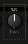
dashed line.png


Edit:
Some users could find annoying or disturbing different colors per channel, while others would love them.
Please consider to add a global preference to enable/disable it, in the case you decide to implement the wish.
 
Last edited:
I like this but how does it work for the various blocks that also have a signature color?

mmmhhh... don't understand what you mean with signature color.

The channels of all blocks have the letters A,B,C,D in orange. And also the outline of any block is orange when the block is selected.
 
mmmhhh... don't understand what you mean with signature color.

The channels of all blocks have the letters A,B,C,D in orange. And also the outline of any block is orange when the block is selected.
I meant like Drive block is red etc. Just wondering if the outline colors will work with the colors of the blocks themselves.
 
Ok, do you mean that the 3 "new" colors of channels B, C, and D match aesthetically with the specific color that each kind of block have. Is it that?

I am sure FAS team would choose these 3 colors properly if they decide to implement it.

As I say in the post: "The tone of the colors I have used is not accurate. Colors should be so different to achieve the goal of avoid confussions, but they should also express different "touchs" or "feelings"."

Also, as you point, it's important also that the 3 new colors match with all different colors that blocks have. Good remark.
 
I meant like Drive block is red etc. Just wondering if the outline colors will work with the colors of the blocks themselves.

I have been checking the colors of blocks now. I think similar colors wouldn't be an impediment.

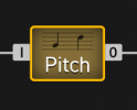
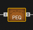
Now Pitch and PEQ blocks have a similar color than the orange of the channels, and everything match fine.

Pitch block selected with the orange outine:

Captura de Pantalla 2021-06-02 a les 17.25.28.png

Same for PEQ block:

Captura de Pantalla 2021-06-02 a les 17.27.35.png

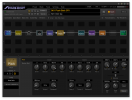
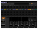
In the context of the editor, colors match fine and everything is clear:

Captura de Pantalla 2021-06-02 a les 17.31.24.png
Captura de Pantalla 2021-06-02 a les 17.31.18.png

In the UI of the FM3, should work in the same way.
Curiosities: PEQ block is green in the FM3 and brown in the Editor.
 
Personally I don’t see this adding much that is useful, and it possibly causing problems with those who are colorblind.

I agree with your point of view. I also wonder how much useful is this wish for all people.

Imo, it would be a very good help for people with visual orientation brain (as me) and/or with clueless brain (as me, I am the champion in this matter).

Also it would help to people that starts editing or creating presets with FM3/AXE (as me). As I said in the post, I find myself too many times changing parameters in the wrong channel.

For experienced people with long time using the editor, I am sure this wish is not necessary. Also people with a relaxed and focused brain wouldn't need this.

Regarding people with visual limitations, I am not an expert. But if FAS implement this wish, I hope they will consider this kind of things.
 
https://uxdesign.cc/color-blindness-in-user-interfaces-66c27331b858 is a nice starting point for those who are interested.

It's always difficult for brands/companies to take care of people that need accesibility solutions.

I think Apple is one of the best companies in taking care of this matter. They are really sensible in this kind of things since the beginning.

There are several threads in the forum asking for accessibilty improvements. All I have read are very interesting.

If FAS decide someday to implement accesibility solutions, probably the best way is to create a new and specific editor, starting from zero in terms of GUI.
The discussion for accessibility sensitivity has occurred in many different threads and Fractal is aware of the need and that they have customers who want it. I’m partially colorblind and don’t trust my perception of color and instead rely on other clues. The editor does well as is, but the outline colors you proposed had problems, hence me speaking up.
 
The discussion for accessibility sensitivity has occurred in many different threads and Fractal is aware of the need and that they have customers who want it. I’m partially colorblind and don’t trust my perception of color and instead rely on other clues. The editor does well as is, but the outline colors you proposed had problems, hence me speaking up.
Very interesting!
I have read the page of apple you linked.
But I don' understand one thing. Hope you can explain it to me.

If you don't trust the colors you are seeing, what is the difference of viewing 4 channels in 1 color or 4 channels in 4 colors?

In both cases, as you say, you don't trust the colors and rely on other clues.
Because the contrast of some of the colors is almost painful, and is definitely distracting.
 
Because the contrast of some of the colors is almost painful, and is definitely distracting.

Ok, understood.

So you say the problem is the tone of the colors I have used in the examples. But with other tones of colors it would work?

In other words, to have different color per channel is not the problem, the problem is the tone (the contrast).

As I said in the post, the colors I have used for the examples are not the perfect colors, they are just for explaining the concept.
Colors must be well selected by FAS.
Interface design, and dealing with vision capabilities, are complex subjects individually. Combined they’re even harder. Color combinations and contrasts are just two of the issues.

I used to be the human interface guy on our Mac development team in-house in a huge electronics company, and was fortunate to have a boss who was a great cognitive science/UI advocate and lecturer. Because of my position I spent a lot of time deep in Apple’s books for development and reading articles by their UI team. Keeping an interface simple is a good starting point because there are fewer things to go wrong.
 
When you say "painful", you mean that colors are too bright and not "soft colors"?
Color luminosity, adjacent color contrast, and color choice. Soft colors can have the same issues. It’s not a simple science.

The existing interface has a color palette that should be observed to keep the overall look of the app cohesive, which Fractal will surely insist on and implement. It’d be nice if it matched the hosting OS also, but that’s a different issue.
 
I was not aware of the colorblind topic. It's the first time I talk of it. Thanks for the replies @Greg Ferguson
Do you think it would be interesting a global setting to reduce contrast/luminosity/adjacent colors/etc.? Something like "Colorblind accessibility" with on/off values?

There is an interesting link in apple's page:
https://www.colourblindawareness.org/colour-blindness/
It says that colorblindness affects to 8% of men in the world. That's a lot.

From the same website, how colors changes depending on the ___nopia:
Jun-02-2021 19-46-41.gif
 
Back
Top Bottom