Forum layout suggestion

Dave Merrill

Axe-Master
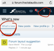
On my phone, the lightening bolt icon in the header goes to What's New. Pretty much 100% of the time i then click the New Posts link in the header, which is really Unread posts, because unsurprisingly, that's what i want to see, not stuff I've already read.

So, my suggestion is that the lightening bolt, or some icon in that location, should go to "New Posts", to skip the middle step of the sequence above, which i do many times a day.

Make sense?
 
On my iPhone I have the lightening bolt at top of page but right in the middle of page I have the picture that iaresee posted above.

Both take me to "What's New" and "New Posts".
 
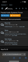
I see this on my iPhone

IMG_2815.png

And that big old blue button goes to the New Posts view just like it says.

Anyways…not going to say this important so don’t hold your breath @Dave Merrill
 
You can also go directly to the New Posts section by simply making https://forum.fractalaudio.com/whats-new/posts/ the bookmark address you use to get to forum. Skipping the need to press any icon at all.

The power to change this is in your hands.
My iPhone shows the following:

View attachment 144931

The lightning bolt takes me to What's new.

That's my normal mode of browsing the forum.

On my iPad (or iPhone in landscape mode) I see this:

View attachment 144932

Nowhere do I see the icon that @iaresee shows...

The lighting bolt icon takes me to the "root" of What's New as @Dave Merrill described - https://forum.fractalaudio.com/whats-new/
I'm on Android, and what i see is the same as your first pic. Like you indicated, the lightning bolt goes to What's New.

That includes things I've read, as distinct from New Posts, which doesn't, making it more useful, to me and I'd imagine most people. That's why it makes sense to me for the top bar icon to go to New Posts. What's New is a wasted step.

I care about this because after I've followed some threads to their conclusion, i don't close the window/tab and reopen the forum from a saved shortcut. I just click the lightening bolt, then New Posts, the sequence i mentioned. Clicking the Fractal logo then the New Posts button does the same. I'm looking to cut out that extra step.

This isn't the end of the world by any means of course. I just wondered if it was a quick config thing, and tbh i thought the logic of skipping that extra step was fairly clear. It's fine if either of those aren't the case, just thought I'd ask.
I just stay on what's new and ignore the ones not unread since it's easy enough to tell which ones are unread.
 
I see this on my iPhone

View attachment 144933

And that big old blue button goes to the New Posts view just like it says.

Anyways…not going to say this important so don’t hold your breath @Dave Merrill
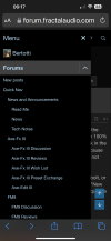
That is what I see on my iPhone if I’m in that area and only at the top. I like to jump to more new posts after I have finished and I’m lazy so I don’t scroll up I just touch the top left drop down, it has me, then forums, then new posts. It is pinned at the top so it is always there no matter how far I scroll down or if I’m in a thread forum or main page.
 

Attachments

  • IMG_3242.png
    IMG_3242.png
    531.6 KB · Views: 4
Last edited:
I just click the lightening bolt, then New Posts, the sequence i mentioned. Clicking the Fractal logo then the New Posts button does the same. I'm looking to cut out that extra step
Yeah, i agree it would be a nice-to-have that both the icon-only button and the New Post button show the same (unread) threads.
 
That is what I see on my iPhone if I’m in that area and only at the top. I like to jump to more new posts after I have finished and I’m lazy so I don’t scroll up I just touch the top left drop down, it has me, then forums, then new posts. It is pinned at the top so it is always there no matter how far I scroll down or if I’m in a thread forum nor main page.
Actually that's the best workaround yet, New Posts link in the top level drop-down.
 
Back
Top Bottom