Wish Color code of channels in grid

Moondog Wily

Experienced
While reading the wish thread on "Scene Ingore indicator/flag in Axe-Edit grid view", it made me think about having the channels be color coded in the grid block views (Axe Edit and front panel of hardware). I understand that I can have the channels letter displayed on the grid blocks using the Alt key, and can also have them displayed all the time IIRC, but it creates a cluttered look IMO. Using this proposed method(s), it would be an instant feedback of the channels for each block that would not interfere with the current view. Here is a mock up screen I did to illustrate this concept.
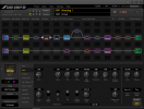
ColorCodedChannels_v01.png

One could also use font color of the name in blocks (Chorus, Reverb, etc) to display the corresponding channel color as opposed to or in addition to the outline color synchronization. I did not mock up a screen for that option, but I think we can all imagine what that would look like ;~))

Dotted, dashed and other types of lines around the outside of the blocks in the grid could also help differentiate their status and provide more visual feedback on active/non-active block setting.

I understand there are a lot of wishes, and I am certain some are due higher priority than this one, but I think it would be great if we could implement this in the Axe Edit and front panel grid at some point down the road!
 
Just click BLOCK INFO or momentarily hold the ALT or OPTION key while looking at the grid.
Yes, I am aware of this, as stated in the second sentence of my original post here! I think it would be nice to not have to click on anything to see such information and it is also, as stated in my post, a less cluttered look IMO!! Thanks for the feedback!!!
 
While reading the wish thread on "Scene Ingore indicator/flag in Axe-Edit grid view", it made me think about having the channels be color coded in the grid block views (Axe Edit and front panel of hardware). I understand that I can have the channels letter displayed on the grid blocks using the Alt key, and can also have them displayed all the time IIRC, but it creates a cluttered look IMO. Using this proposed method(s), it would be an instant feedback of the channels for each block that would not interfere with the current view. Here is a mock up screen I did to illustrate this concept.

View attachment 98501

One could also use font color of the name in blocks (Chorus, Reverb, etc) to display the corresponding channel color as opposed to or in addition to the outline color synchronization. I did not mock up a screen for that option, but I think we can all imagine what that would look like ;~))

Dotted, dashed and other types of lines around the outside of the blocks in the grid could also help differentiate their status and provide more visual feedback on active/non-active block setting.

I understand there are a lot of wishes, and I am certain some are due higher priority than this one, but I think it would be great if we could implement this in the Axe Edit and front panel grid at some point down the road!
Using color alone to signify something doesn’t work well for for people who have color-blindness. Turn off the colors for your display to get an idea.

Read the discussion in @jordik’s link above.
 
Sorry, I spent a good half an hour searching the wish list and did not find this (doh)! Looks like there was a long discussion about why we should not use colors for UI, so I guess some of the options presented in your post or the suggestion in my post of dotted/dashed/combo outlines may work! Could also allow users to turn this on/off with colors, thereby satisfying those users who are colorblind or not! Still on my wish list ;~)) When I hit a switch on my FC-12 to change channels, I want visual feedback that it has happened on the axe screens other than the letter on a given block.
 
Using color alone to signify something doesn’t work well for for people who have color-blindness.
True, tho in this case channel indication might be more of a visual nicety not a necessary UI element in order to use it. (EDIT: unless it confused bypass state indication for CB folks.)

For something like scene ignore, using an S, a dot, or a different style outline would make it universally useable.
 
I like the idea and would love to have a way to see both which channel each block is and if it's set to ignore, although the mockup is kind of painful to look at with different colored outlines around the blocks (which also are different colors).

I'd prefer something like @yyz67 idea of an S or dot...
The colors have the following logic.

If the block is selected (in this case Amp) it is bright in that color (100% opacity).

If the block is not selected, and it is active (not bypassed) I set the border color to 36% opacity, and its background (that the 36% lets through) is the border color of the original print screen color for such an item (almost a white).

If the block is not selected, and it is bypassed (not active), I set the border color to 36% opacity, and its background (that the 36% lets through) is the border color of the original print screen color for such an item (a mid range gray).

It does not need to be like this, but this is why there are multiple shades of the channels color. One for selected, one for active and one for bypassed (although only one selected item). Did not expect this to be a final design nor a marvel to look at, just a display of concept ;~)) Sorry for your pain!!

There are some good examples in jordikt's version of identical concept he made in 2021 at https://forum.fractalaudio.com/threads/differentiate-channels-with-colors.173579/ as he listed above. His concepts of markers (and design mock ups) may be more to your liking! I just hope we can find a way to implement this where everyone can be happy ;~))
 
Sorry, I spent a good half an hour searching the wish list and did not find this (doh)! Looks like there was a long discussion about why we should not use colors for UI, so I guess some of the options presented in your post or the suggestion in my post of dotted/dashed/combo outlines may work! Could also allow users to turn this on/off with colors, thereby satisfying those users who are colorblind or not! Still on my wish list ;~)) When I hit a switch on my FC-12 to change channels, I want visual feedback that it has happened on the axe screens other than the letter on a given block.
No problem, I put the link to the thread just to share ideas.

Colors of channels in editors would be a useful feature. It should be a checkbox in the preferences of the editor to enable/disable it, for the users that don't want it.
 
Color-coding is frowned upon due to color-blindness concerns.
I empathize with those who are afflicted by such a condition, but that does not mean it can not be implemented with an on/off in preferences. There are several options to work with color in the current system for valuable visual feedback, and this would simply be another that I think would help users like myself get the data they want from a glance at the edit screen or the machine screen.

As mentioned here and in jordikt's post on this topic from 2021, there are other options as well. Dotted/dashed/combo outlines on the block display could be indications of what channel is selected. Shapes could be used (triangle = A, square = B, circle = C and dash = D) as well to give quick look feedback on what channel is enabled for any given block.

Setting the channel information display (currently available when you hold down the Alt key or hit F1 to toggle on off the block info) is good, but I need to be pretty close to the screen to see what letters are being displayed, and colors, shapes or different border lines would give me better visual feedback IMO.

Just a wish and as stated in original post, I understand it is most likely not as important as other wishes, but the wish remains! Thanks for all the feedback and I will return to my regularly scheduled guitar fiddling!
 
Opposite the color marking could appear a * next to the letter if Scene Ignore is active?

In the block info A*

Is this also possible in the Scene Manager? To see Scene Ignore also at this Postion
 
Back
Top Bottom