CHARACTERS IN THE MINIDISPLAYS OF THE SCENES

Ubaldo

Member
Good morning, everyone. Is it possible, in your opinion, to increase the font size of a scene name and maybe also the color? I do not see very well, I am farsighted and unfortunately I cannot wear multifocals. Also I am very tall and when I play, with FM9 at my feet, I can't distinguish the scene name well. Thank you all,
 
Here are a few items that might help.
  • Make sure the Contrast is Set Correctly
  • Setup the switches for Inverted Font
  • Use ALL CAPS for labels.
  • Use the Ring Colors to denote Meaning, Green-clean, etc.
  • Get mini magnifiers that sit on-top of the labels.
  • Get an FC Mark II.
 
Thank you all for your answers. Unfortunately I had already done everything you suggested but my problem remains the small fonts. I hope that with the new firmwares to come the text size can be improved. Again thank you all
 
I don't have an FM9 yet - mostly due to the small and to me barely readable text in the mini displays on my FM3, original FC 3 and FC 6.

I've been waiting for an updated FM9 with displays like on the FC mk II series, but I know that update might not come for a long time.
Could anybody post a pic of the mini displays with the inverted fond ?

Thanks,
RB
 
I don't have an FM9 yet - mostly due to the small and to me barely readable text in the mini displays on my FM3, original FC 3 and FC 6.

I've been waiting for an updated FM9 with displays like on the FC mk II series, but I know that update might not come for a long time.
Could anybody post a pic of the mini displays with the inverted font ?

Thanks,
RB

Here ya go...forgive the dust, it's just prior to spring cleaning...

2rOG0WU.jpg
 
I've had my FM9 about 16 months, and here's where I'm at regarding the scribble strips.
They are useful when sitting on the floor programming with the front (top?) panel.
If I'm sitting in a chair, playing recreationally and noodling around with factory presets, I'll look at them to navigate between scenes or toggle individual effects on and off.
When I'm performing, rehearsing, or using one of my custom presets which is 95% of the time, I don't even look at them, nor would ever have the need to.
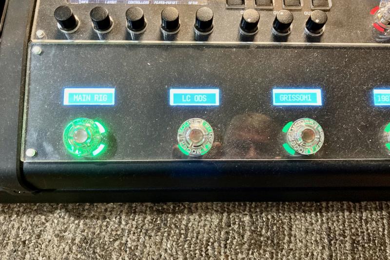
That being said, inverted or not, contrast adjustment any which way you like, they look terrible. Washed out, small print, mostly wasted space in the screen. And inverting them leaves a large light border around the text, making it even harder to read than the standard layout. I also am not in love with the switches themselves (I'm still reeling over being told to grease the electrical switches when I bought it), so a redesign of the whole module wouldn't upset me.
But the scribble strips are the least important hardware feature on the unit so if corners were to be cut, that's where I'd like to see it so cudos to whomever made that call to keep the target bottom line.
 
I recently went so far and gigged with my AxeFX3T and FC12 Mk II...definitely the use case I bought the FM9T for...
 
Back
Top Bottom