m lebofsky
Experienced
Just received my AXE III and FC-12. Count me in for improved readability of the FC-12 scribble strips. Larger font size?
I tried those. Hated 'em. 2 pair of bifocal glasses now: distance + mid for out and about, and mid + close for around the house. Without them, stuff more than 3 feet away takes on a rather Monét-esque appearance.I understand the request. It's one thing if you have perfect vision, or vision that's correctible with a single- focus lens. But once you get into bifocal territory, all bets are off. At best, you'll have graduated lenses, where the 6-foot focus is well up on your lenses. That means you can forget about just glancing down to see the floorboard. You have to drop your head until you're facing almost straight down, and you'll have only a very narrow angle in which you can maintain focus. It requires extreme but precise head movements, and you have to do it quickly to stay in the song. It's not easy, and it can be headache-inducing. An option for larger text could be helpful.
This helped me a bit. I am thinking about some sort of magnifier, though, if I can't find an eye doc who can create me a script that lets me read my toes.I used Axedit to change all my preset and scene names to all CAPS . Might be slightly helpful but far from a solution.
 )
)It's a necessary use case. You don't want to market a controller for the world's best modeller if it's useless for an outdoor gig.I private messaged Cliff a long time ago to ask “why” these screens weren’t OLED. He said it was designed to work in bright daylight... I’m not too sure why that is the preferred use case...
Necessary yes... preferred.. maybe not for me. (Combination of eyesight and majority of gigs)It's a necessary use case. You don't want to market a controller for the world's best modeller if it's useless for an outdoor gig.
I drive by the colored LED rings, changing them to suit different layouts.
Just discovered this thread. Same problems. So far, what has helped:
- Adjusting the Mini-Display Contrast and Global Brightness at the start of every session to fit current lighting conditions
- Turning the 'Ring Intensity' parameters way down helps me discern the limited contrast of the mini displays
- First 10 characters of preset and scene names in all caps
- FC custom labels in all caps
I would love a Helen Keller mode that optionally traded a couple of characters on the mini displays for better readability.
Someone a while back was talking about magnifying lenses that make the text appear larger, made from plexiglas rods split in half to make a lens.i can see how that would work for control switches and i may do as others have suggested and colour-code them by effect type, but i just want to be able to select a preset when i need to without having to bend over to see the screens. i can never remember what number they all are.
Would smaller bars magnify enough to help and not be in the way of a foor stomping the switch?I mentioned and did the 1” magnifier bars but ultimately abandoned the idea.
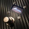
They fit display height perfectly (cut to length). But, the platform height they raise interferes with the height of the switches. It felt funny to my feet, and also looked goofy. Still have trouble reading the scribbles but not for example the logo finer print on the FC12 body and thats a smaller font. Personally I think an inverse coloring ( black background, white text) option would make a huge difference for those who need it. I’d use it. Hoping for that feature one day.
Magnifier Bars are here if anyone interested.
Amazon product ASIN B0011X0PAU