Is it me or is the Axe fx 3 aesthetically unpleasing?

I think it looks great for the functionality that it was design for. But one thing is for sure that it will be easy to spot in other peoples racks especially with the blue led logo. No guessing on what's that mysterious thing in their rack anymore.
 
I think it looks fine.
Don't like that it's 3U, but that a usability issue, not a visual design issue.

Though, i think amp modelers should aim to look more "vintagy", and "analogy", not like spaceship controls. I think that fits more with the nature of guitarists, and their asociations that vintage and analog is good. I think Positive grid is nailing it with their amp modeler hardware designs.
 
Last edited by a moderator:
Not that, please!
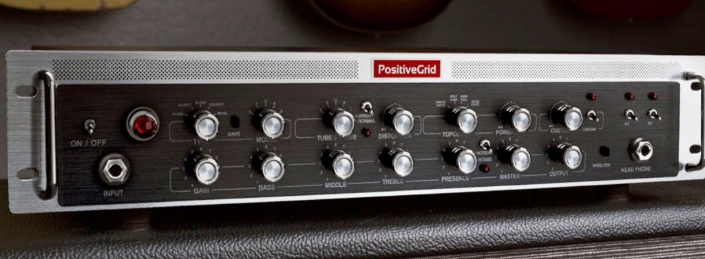
Seriously mate, this amp modeller looks sexy
575040d1469777192-positive-grid-announces-bias-rack-amplifier-image.jpg
 
Anyone else feel that the new version is ugly? Maybe I shouldn’t judge a book by its cover ... I really preferred the 2U style ! Now I have to get a new rack system built in my studio to cater for a 3U... #FirstWorldProblems
Really?..... No. I prefer to judge gears by their functionality and not by how they look like (well except for guitars...).
But if you prefer there's a nice green toaster on the market....
 
Meh... not my favorite outfit (couldn’t care less for larger screen / front panel knobs if the price to pay is 1 extra U), but I mostly care about the inner beauty than the outer aesthetics, so...
 
I’m still gonna buy it and enjoy it . But like someone else said earlier ... in some pictures it looks like a prototype than a final product... but I’ll have to wait and see when I have it in my hands .
 
The blue frequency analyser thing on the big screen just makes me want it even more! There is a 3U size hole in my rack aching to be filled :)
 
To each his own I guess...

I personally found the Axe FX II pretty ugly with a bad UI, and that always been one of the main reasons I didn't want it.
In the other hand, I like the Axe FX III quite a lot, I think the UI is really well improved (not as good as Helix/Headrush) but already "good enough" for me, and I think it does look quite sexy now... to the point I want one.

So if the goal for Cliff was to get more new customers, it works on me. YMMV
 
It's not ugly, but I don't like this blue led AXE FX III logo. I little prefer design of AXE II, but it could change in the future :)
 
It looks great!!!
...heck ...put the AxeIII guts in a worn out cardboard box with seamless switching and amps and fx galore in one preset......and I'd park that into my rack!!

And the 3u? With all that extra power and larger display...thank goodness they fit in a 3u and not 4u!!

No brainer!! AxeIII all the way!
 
Back
Top Bottom